Sunday, 1 December 2013

Counting forwards day by day Advent calendar - and backwards month by month...

Whaaaaa!  Was it really June I was last here?   What happened?
Well here's an Advent Calendar game I designed a few years ago.
Let me know if you can't open each day - on the right day.
Children might like to guess what's inside each present before they click on it.  If they jump ahead of the day, they'll get a pop-up which should animate.  I designed it some years ago and though I did not manage to change the old fonts as I'd like, it still works - thanks to my Sidney-based web hoster Simon Specker.  Since the late 1990s he has hosted me at Planet Homepage in exchange for having hosted him years before during his trip around Europe.

There's another advent calendar I helped the SCBWI Words and Pictures team  put together.   This one is new this year.  Have a look at our Society of Children's Book Writer and Illustrators' advent calendar which will grow day by day as a different illustrator is added on until December 25.

I haven't been idle since my last post in June.
And it's brought me two exciting new contracts, one French, one English for two very different picture books that I'm writing as well as am illustrating (more about those soon).

Time now to recapitulate the months I missed on this blog with a highlight or two per month.

July - an inspiring SCBWI Picture Book retreat with Helen Stephens and Gerry Turley in a dream location on the River Avon, alongside other authors and illustrators and visiting publishers from Egmont and Hodder.

August -  alongside the books I was working on a series of paintings for the Time for a Rhyme feature in Bayard's English Storybox Magazine.  Here's a glimpse of the first one for the September issue...
My son and I managed a week off and a long drive from London via Paris to the Lot to sketch scenery around Les Eyzies for another story I'm working on.
Incredible rock formations...quick crayon 
watercolour sketch in the heat


September - a dose of picture book dummy doctoring with fellow author-illustrator, the wonderful Sue Porter for a SCBWI BI illustrator masterclass we hope we gave fellow creators a fresh angle on their projects for picture books texts and images.

October  - A big sorting out and new storage in my home studio -  10 big wide smooth moving draws, and lots more shelf and desk space, built by a brilliant carpenter (contact me if you need a good one in London!)  and no less than 34  big delicious pears on my little Conference pear tree  which I  planted a year and a half ago, in my garden near Brick Lane.

November - work on my books, another commission for Highlights High Five, and a last minute charity sale to set up of SCBWI Showcase illustrator prints, at the SCBWI Winchester conference in aid of the Philippines Typhoon Appeal . An inspiring conference - a lot to take in but I had a moment to relax afterwards on the Eurostar to Paris for a working meeting with Bayard.
I managed to fit in the Grand Palais to see the huge Braque show.
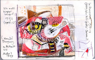
No photos allowed - fortunately I had a few coloured pencils to record a thumbnail of
Braque's 1934 Still Life with Red Tablecloth


The Vallotton exhibition was huge and full of work I didn't know...Somehow the same day I managed an hour at the French kids book fair before the train back to London.

A couple of days later, this weekend, two seasonal fairs in South London with other CWISL authors and illustrators.  I read Mini Racer, at Feast Fair's CWISL stand today. The children coloured in snails on skateboards, and "dotty dog" cars and boy did we make tracks with them!


 There I've caught up with myself - not too late for December 1st and the Advent launch...and  just in time to make dinner - phew!


Saturday, 15 June 2013

Inspiration from children's writing and illustrating at our CWISL Shoutsouth Festival

A spark to set us off from storyteller Margaret Bateson-Hill at the start of  Shoutsouth  
"There are some events you do that blow you away. Shoutsouth Festival was one of those."

So tweeted Margaret Bateson-Hill today after 3 days of writing and illustrating workshops with over ninety 8-13 year olds from a range of South London schools.
We're all part of a group called CWISL - published writers and illustrators promoting the love of reading, writing and illustration with children from all backgrounds. The children's stories and pictures will be published on CWISL's  Shoutsouth website when they are all scanned and typed.
Until then, here are some photos I took to keep me inspired!
I found this lost-looking man among the cuttings...
Designing book covers with my Leopard team
Mo directing  tableaus of emotions
as a prelude to our workshops
Writers Beverley Birch smiling
and Mo O'Hara inspiring kids


Helen (H L Dennis) centre showing off some covers that our 23 'Leopards' in my workshop
with two Leopards of different ages from different schools.

Author J L Buxton and ME  (ahem Bridget!)  with our Leopard display...pity our other Leopard leader
author Sara Grant couldn't be there today - some great stories to read online later! 
"Cold Joker" a great cover with a story behind it

Tissue paper helped  make this cover suitably mysterious
A cover by a WW2 expert aged around 8
Cover to a sad and gripping story
by another Leopard aged around 12
A collaborative cover and story with a political twist
  by two Primary schoolmates - 

The Panther team's display with "sharpie" focused drawings inspired by author -illustrator Gillian McClure's workshop.

The Lions' display with some covers inspired by author-illustrator Jane Porter's workshop
This cover from Jane's Lion workshop caught my eye! 
SCBWI illustrator Anne-Marie Perks got the Tiger team sculpting characters
Author Andrew Weale Master of Ceremonies entertaining at the grande finale
London South Bank University offered us workrooms and an auditorium, other sponsors like Rymans donated materials, but the hoped-for public grant didn't come through because of cuts.  So all the work that Carnegie shortlisted author, editor and CWISL founder Beverley Birch, and chair Sarah Mussi, and all of us others put into preparations, school visits and workshops, was entirely voluntary.

The week before many of us prepared for the Festival by visiting libraries and schools.
I loved Battersea Park Library and meeting fellow CWISL authors HL Dennis and Lydia Syson at Bessemer Grange School.  (Coincidentally I had just enjoyed reading Lydia's book "A World Between Us"  which starts with the battle at Cable Street which her grandfather had seen and ends with the Spanish Civil War battle of the Ebro which my Catalan uncle fought in aged 17.)

It was a commitment which meant a lot of time away my own writing and illustrating. However never have I felt more rewarded.  And humbled.  It was heartening to see kids of varying ages, backgrounds and schools work together - all thanks to books!
It's all here - what books can do for kids.
And to witness the energy the kids put into their work, the thought and dedication over 3 days was truly inspiring.  
What it's all about, really!

Feedback from one child : "I think Shoutsouth is a very eye-opening experience which reveals the work and success of illustrators and authors. You feel like a real author illustrator!"


I AGREE!

Sunday, 9 June 2013

Creativity is letting your mind go wild, on the way to work. From Dallington School to Courtyard Studio

On my way to work last Thursday in Courtyard Studio in Clerkenwell, a window in Dallington Street caught my eye.
A builder nearby told me I was the third person that morning to stop and photograph it.  Despite the problem with the glass reflections I had to record the stunning variety of children's paintings and collages under a panel
"We asked 130  3-10 year olds What is Creativity?" 
The watercolours that first caught my eye in morning son (plus a reflection of the  builder...)
"A creative person is someone who creates things,
for example a guy who does plastic surgery is a creative person."

LEFT "A creative person has a rule you would most probably not have."
RIGHT " If someone is creative they make new things that have never existed before."


Collages by younger kids

Close up of above with reports of comments by younger kids - bottom left "A superhero with special powers.  It is going to be a three-eyed surperhero from the factory."

LEFT The Roman Empire was creative.  It created sandwiches, sewers and books!
RIGHT Creativity is letting your mind go wild.

I get to Panther House which is a warren of film, animation, design and illustration studios like our Courtyard Studio far left of Reception.
Surprised to see these metal stencils of intriguing texts lying near the entrance - cast offs?
In our studio  there was Viv Schwarz with her patchwork monster  - I asked her to sit on it,  like a flying carpet.
She says she often adds to it when moving house as she is at the moment...  


Some smaller metal stencils rescued from the bin  - and a parrot etc - near illustrator Jane Smith's desk.

Karen Littlewood's corner with  a life size Immi from her book.

Our old and friendly Grant Enlarger which helps us redraw at greater or lesser size,
That way, unlike with scanning, we can keep lines at the same pencil width.
On top of Grant sits a couple of mannequins near fabric designer Nicola Gregory 's corner.

Some inspiration on shelves behind my desk...
Adrian Taylor's art corner is behind my 'wall' on the right.

View from my desk over my wall to the kitchen corner  and the window
You can see  the skip where we find the odd treasure to recycle...


Tuesday, 7 May 2013

Varoom 21 Welcome to your Awesome Robot by Viviane Schwarz, Flying Eye Books


Here by popular request, ahem, is the short article I wrote recently introducing Viv Schwarz's new book, Welcome to your Awesome Robot published by Flying Eye Books (about which more soon!) followed by her answers to questions for the Association of Illustrator's quarterly magazine Varoom 21

By the way, Varoom is full of inspiring stuff for illustrators of all specialities and is on sale at a competitive price given the content - the newspaper format helps keep it affordable.  And I love the layout in general too - here's a snap of this spread in the mag,  with a few of Viv's illos  - kudos to the designers!  If you want something more kid friendly about Viv and interaction, then I can recommend Playing by the Book's post - fun!  
Anyway, here's my Varoom piece...


Illustrated children’s books seem to be happily breaking rules these days. You’ll find more and more books with unusual shapes, in formats that don’t conform to the classic 32 page picture book.  And these new books aren’t always guided by story. Many are hands-on spaces for kids to play and think as well as draw and make. 
Behind this, in part, are publishers like Tate Publishing,  Phaidon and now Thames & Hudson.  They began by importing choice books from across the Channel, but increasingly they are creating their own titles and selling more of these format-breaking books in an ideal niche market – the busy museum shop.
Nobrow too, is casting its net wider after establishing an innovative reputation for comics and graphic novels, and it has created its own set of rules, using distinctive and sustainable printing methods and playing with all kinds of formats, striking colour and paper stock.

This month (February 2013)  sees the launch of Nobrow’s Flying Eye Books, their new kids book imprint, which aims to counterbalance e books and apps, with beautifully designed books that will find a permanent place in the home or child’s bedroom. 
It’s fitting that Viviane Schwarz  (creator of the successful There are No Cats in this Book  published by Walker Books), has her latest rule-breaking book, Welcome to your Awesome Robot, coming out as the first of their new titles. Viviane Schwarz mixes genres effortlessly. This one is part comic story, part manual. And it’s a wholly engaging way to furnish kids with ways to think out of the box, literally.  Parents, by the way, are given rules to keep them quiet.
Viviane says she drew this book “digitally without detailed roughs, which was usefully awkward. A bit of awkwardness encourages people to join in creatively because they feel their own work compares well“.
It reminds me of something Matisse said about leaving an awkward chink somewhere in the painting, something  a bit rough that doesn’t quite fit in.  It’s this, he says, that acts like a kind of door into the painting,  to pull you in to really looking and interacting with it.    
I sense there a bit of loosening up these days in illustration approaches more generally. Perhaps it’s in reaction to the deadening polish of the digital tidy-up; a touch of awkwardness, a bit of rough that’s like raw, acoustic music.  It’s also another way of saying “hey come on in and play!”
  
Viviane Schwarz  Welcome to your Awesome Robot
Brief:
An exciting picture book for NoBrow's new children's book imprint, Flying Eye Books.

Idea:
You know when you climb into a cardboard box and it becomes a robot? You always need to explain it to people. Or maybe you need a manual to help you upgrade that robot until its awesomeness is beyond doubt. This is that manual.

Materials:
Cintiq, Mac, drawing glove, Photoshop… plus a huge felt tip pen and an A3 sketch pad.

Research:
I started with some very early memories of my big sister who transformed herself into a vending machine for my birthday, and built on that - with cardboard and tape.
I asked friends who are makers how their childhood projects (or the projects of their children) were organised, and had them triple-check the book for mistakes, especially the workshop rules.

Process:
I drew digitally without detailed roughs, which was usefully awkward. A bit of awkwardness encourages people to join in creatively because they feel their own work compares well. A few elements are drawn with a monstercolors marker pen, scanned and sized down: clouds of steam, incidental graffiti, some of the lettering.

Resistances:
There were technical challenges - notably the need for colour separation - but they were enjoyable.

Insight:
I am expecting the best insights to come when people I've never met start using the book. I know it causes robots, but not what kind, and I can't wait to see.

Distractions:
It's very hard to distract me from cardboard robots. I am quite sure this was the most focussed book project I've ever done.

Numbers:
3 colours - Red, blue, brown. I lost count of everything else involved. I lost count of pages at one point, which was alarming.

Rules:
The tear-out sheet of workshop rules is the most important part of the book for me. These rules are not just to keep the children safe and everyone reasonably happy, but to keep the adults from taking over.

Motivations:
When I was a child, my parents encouraged me to be creative. They taught me to respect the tools and not to be wasteful, but they would always let me mess things up - learning was more important than "beautiful" results. I want to help others to have that experience.
And I want that manual to exist that I imagined as a child, the one that makes my robot awesome.

Saturday, 27 April 2013

Tower Bridge and its exhibition of This is London by Miroslav Sasek

I promised more about Tower Bridge in my last post so here it is.
Several of us children's authors and illustrators from CWISL were lucky enough to be invited to the opening to an exhibition of  Miroslav Sasek's 1959 children's book, THIS IS LONDON in an exceptional site - the top of Tower Bridge.

When I first moved to the East End I spotted this mosaic view of Tower Bridge on a school near me.


Next time I crossed Tower Bridge I was on my bike, and had to wait for the road to sink back to a horizontal, after a ship passed underneath it.

Waiting  by the north tower, for Tower Bridge road to right itself.


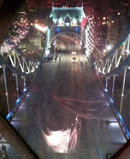
I never dreamed that a year or so later I'd be inside it, high up on one of the Walkways looking over the Thames across London as dusk descended (sorry about the bad photos but it gives an idea!)


Hard to imagine the Tower Bridge Walkways were once open to the sky,
and a place for illicit rendez-vous.
Now there are screens upon screens to view inside and out, 
including enlargened panels of Sasek's THIS IS LONDON.


Sasek is one of my favourite illustrators.  I'm so glad his books from the 1950s and 60s have been reprinted the past few years.   He has a rare gift for bottling the visual essence of a city and its people, and avoiding cliché.  The work is beautifully measured across the white of the spreads -  minimal, sharp and funny.


I had hoped to see original paintings here - but learnt they were dispersed or lost after his death.  If anyone knows where one is, please let me know!  You can see more illustrations and find out more about the mysterious Sasek here.

In any case, it was an interesting display.  
It's hard to give a proper sense of it so see it for yourself if you can.  
The Sasek exhibition is on for a long while and Tower Bridge is open every day.
Bring kids and/or sketching gear and a better camera than mine!

There's a large map of the covers of all the books Sasek illustrated across the world.

On my way down I saw where I'd waited on my bike for Tower Bridge road to come down.
Hard to imagine this road lifting!

Tower Bridge shining behind Thames barges near Wapping